Flutter 学习之旅 之 flutter 使用 【验证码】输入组件的简单封装
Flutter 学习之旅 之 flutter 使用 【验证码】输入组件的简单封装
目录
Flutter 学习之旅 之 flutter 使用 【验证码】输入组件的简单封装
一、简单介绍
二、验证码组件
三、实现简单效果预览
四、验证码组件样式设置
五、关键代码
一、简单介绍
Flutter 是一款开源的 UI 软件开发工具包,由 Google 开发和维护。它允许开发者使用一套代码同时构建跨平台的应用程序,包括移动设备(iOS 和 Android)、Web 和桌面平台(Windows、macOS 和 Linux)。
Flutter 使用 Dart 编程语言,它可以将代码编译为 ARM 或 Intel 机器代码以及 JavaScript,从而实现快速的性能。Flutter 提供了一个丰富的预置小部件库,开发者可以根据自己的需求灵活地控制每个像素,从而创建自定义的、适应性强的设计,这些设计在任何屏幕上都能呈现出色的外观和感觉。
二、验证码组件
该验证码组件通过组合多个自定义的输入框(VerifyCodeBoxItem)和一个隐藏的 TextField 来实现。每个 VerifyCodeBoxItem 代表验证码的一位,可以自定义样式(如下划线或盒子)。隐藏的 TextField 用于实际的文本输入,其输入内容通过监听器(onChanged)更新到对应的 VerifyCodeBoxItem 中。
特点与优势
自定义样式:支持两种输入框样式(下划线和盒子),并允许自定义边框颜色、宽度、圆角大小等,满足不同设计需求。
光标显示:可选择是否显示光标,以及自定义光标颜色、宽度和位置,提升用户体验。
焦点管理:支持自动获取焦点和输入完成后失去焦点,方便用户操作。
输入限制:仅允许输入数字,且输入长度限制为验证码位数,避免无效输入。
回调函数:提供输入完成的回调函数,方便开发者处理输入结果。
易于集成:作为一个独立的组件,可以轻松集成到任何 Flutter 项目中。
以下是详细的实现原理:
1. 核心组件结构
VerifyCodeBox:这是主组件,负责管理整个验证码输入框的逻辑。
VerifyCodeBoxItem:这是子组件,用于表示验证码输入框中的每一位。每个VerifyCodeBoxItem显示一个字符,并可以自定义样式(如边框、圆角、光标等)。隐藏的
TextField:用于实际的文本输入。用户的所有输入操作都在这个隐藏的TextField中完成,而显示则通过VerifyCodeBoxItem来实现。2. 实现步骤
初始化状态
在
_VerifyCodeBoxState中,初始化一个TextEditingController和一个FocusNode,分别用于控制输入内容和焦点。初始化一个
_contentList,用于存储每个输入框的文本内容。列表的长度等于验证码的位数(count)。构建输入框
使用
Stack将隐藏的TextField和显示的VerifyCodeBoxItem组合在一起。隐藏的
TextField通过TextField组件实现,设置为透明样式(TextStyle(color: Colors.transparent)),并隐藏边框(InputBorder.none)。每个
VerifyCodeBoxItem通过VerifyCodeBoxItem组件实现,显示当前输入的内容,并根据是否获取焦点动态更新边框颜色。输入监听
监听隐藏的
TextField的onChanged事件,当用户输入内容时,动态更新_contentList中对应位置的字符。根据输入内容的长度,更新每个
VerifyCodeBoxItem的显示内容。焦点管理
使用
GestureDetector包裹整个输入框,点击时请求焦点。如果输入完成且
unfocus属性为true,则在输入完成后取消焦点,隐藏软键盘。回调触发
当输入内容的长度达到验证码位数时,触发
onSubmitted回调函数,通知外部输入完成。
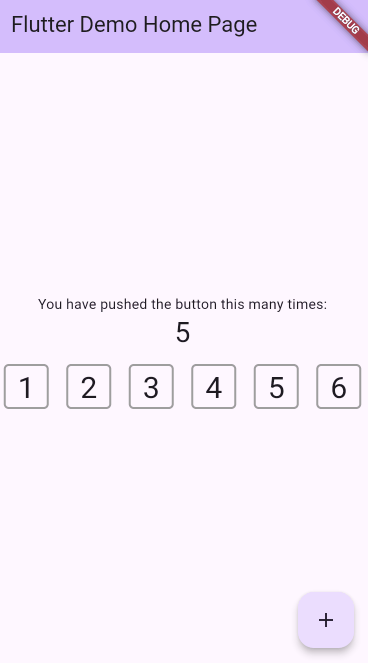
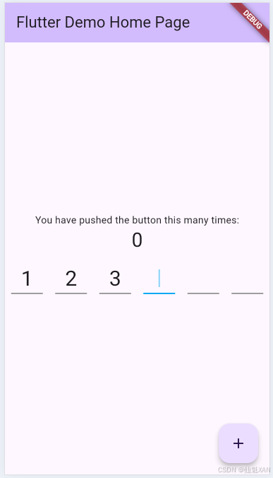
三、实现简单效果预览
四、验证码组件样式设置
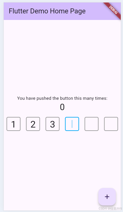
1、矩形的验证码输入框
2、下划线验证码输入框
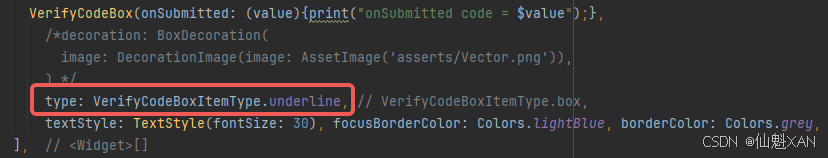
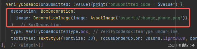
3、自定义验证码输入框
注意:设置了 decoration样式,会由于 type 显示
五、关键代码
1、main
import 'package:flutter/material.dart';
import 'package:test_verify_code/verify_code/verify_code_box.dart';
import 'package:test_verify_code/verify_code/verify_code_box_item.dart';void main() {runApp(const MyApp());
}class MyApp extends StatelessWidget {const MyApp({super.key});// This widget is the root of your application.@overrideWidget build(BuildContext context) {return MaterialApp(title: 'Flutter Demo', // 应用程序的标题theme: ThemeData(// 应用程序的主题配置colorScheme: ColorScheme.fromSeed(seedColor: Colors.deepPurple), // 使用深紫色作为主题色种子),home: const MyHomePage(title: 'Flutter Demo Home Page'), // 应用程序的首页);}
}class MyHomePage extends StatefulWidget {const MyHomePage({super.key, required this.title});final String title; // 页面标题@overrideState<MyHomePage> createState() => _MyHomePageState();
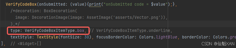
}class _MyHomePageState extends State<MyHomePage> {int _counter = 0; // 计数器,用于记录按钮点击次数void _incrementCounter() {setState(() {_counter++; // 每次点击按钮,计数器加1});}@overrideWidget build(BuildContext context) {return Scaffold(appBar: AppBar(backgroundColor: Theme.of(context).colorScheme.inversePrimary, // 使用主题的反向主色作为AppBar背景title: Text(widget.title), // AppBar的标题),body: Center(child: Column(mainAxisAlignment: MainAxisAlignment.center, // 子组件居中对齐children: <Widget>[const Text('You have pushed the button this many times:'), // 提示文本Text('$_counter', // 显示计数器的值style: Theme.of(context).textTheme.headlineMedium, // 使用主题的标题样式),VerifyCodeBox(onSubmitted: (value) {print("onSubmitted code = $value"); // 输入完成时打印验证码},/*decoration: BoxDecoration(image: DecorationImage(image: AssetImage('asserts/change_phone.png'), // 背景图片),),*/type: VerifyCodeBoxItemType.box, // 输入框样式为盒子样式textStyle: TextStyle(fontSize: 30), // 输入框文本样式focusBorderColor: Colors.lightBlue, // 获取焦点时的边框颜色borderColor: Colors.grey, // 默认边框颜色cursorColor: Colors.lightBlue, // 光标颜色showCursor: true, // 显示光标),],),),floatingActionButton: FloatingActionButton(onPressed: _incrementCounter, // 点击按钮时调用计数器加1的方法tooltip: 'Increment', // 按钮的提示文本child: const Icon(Icons.add), // 按钮的图标), // This trailing comma makes auto-formatting nicer for build methods.);}
}代码注释说明
主入口:
void main()是程序的入口点,调用runApp启动应用程序。
MyApp类:
MyApp是应用程序的根组件,使用MaterialApp创建一个 Material Design 风格的应用程序。设置了应用程序的标题和主题颜色。
MyHomePage类:
MyHomePage是应用程序的首页,继承自StatefulWidget。包含一个计数器
_counter,用于记录按钮点击次数。提供了一个
_incrementCounter方法,用于增加计数器的值。
_MyHomePageState类:
_MyHomePageState是MyHomePage的状态管理类,负责构建页面内容。使用
Scaffold构建页面结构,包含AppBar和FloatingActionButton。在页面主体中,使用
Column布局,包含一个提示文本、计数器文本和一个验证码输入框(VerifyCodeBox)。验证码输入框:
VerifyCodeBox是验证码输入框组件,配置了以下属性:
onSubmitted:输入完成时的回调函数,打印输入的验证码。
decoration:自定义背景图片。
type:输入框样式为盒子样式。
textStyle:输入框文本样式。
focusBorderColor:获取焦点时的边框颜色。
borderColor:默认边框颜色。
cursorColor:光标颜色。
showCursor:显示光标。其他组件:
FloatingActionButton:一个浮动按钮,点击时增加计数器的值。
Text:用于显示提示文本和计数器的值。
2、VerifyCodeBox
library flutter_verification_box;import 'package:flutter/cupertino.dart';
import 'package:flutter/material.dart';
import 'package:flutter/services.dart';
import 'package:test_verify_code/verify_code/verify_code_box_item.dart';///
/// 验证码输入框
/// 一个可自定义样式的验证码输入框组件,支持多种配置,如验证码位数、输入框样式、光标显示等。
///
class VerifyCodeBox extends StatefulWidget {VerifyCodeBox({this.count = 6, // 验证码的位数,默认为6位this.itemWidget = 45, // 每个输入框的宽度required this.onSubmitted, // 输入完成时的回调函数this.type = VerifyCodeBoxItemType.box, // 输入框的样式类型,默认为盒子样式this.decoration, // 自定义输入框的装饰this.borderWidth = 2.0, // 边框宽度this.borderRadius = 5.0, // 边框圆角大小required this.textStyle, // 输入框内文本的样式required this.focusBorderColor, // 输入框获取焦点时的边框颜色required this.borderColor, // 输入框默认边框颜色this.unfocus = true, // 输入完成后是否失去焦点,默认为truethis.autoFocus = true, // 是否自动获取焦点,默认为truethis.showCursor = false, // 是否显示光标,默认为falsethis.cursorWidth = 2, // 光标宽度required this.cursorColor, // 光标颜色this.cursorIndent = 10, // 光标距离顶部的距离this.cursorEndIndent = 10, // 光标距离底部的距离});////// 几位验证码,一般6位,还有4位的///final int count;////// 每一个item的宽度///final double itemWidget;////// 输入完成回调///final ValueChanged onSubmitted;////// 每个item的装饰类型,[VerifyCodeBoxItemType]///final VerifyCodeBoxItemType type;////// 每个item的样式///final Decoration? decoration;////// 边框宽度///final double borderWidth;////// 边框颜色///final Color borderColor;////// 获取焦点边框的颜色///final Color focusBorderColor;////// [VerifyCodeBoxItemType.box] 边框圆角///final double borderRadius;////// 文本样式///final TextStyle textStyle;////// 输入完成后是否失去焦点,默认true,失去焦点后,软键盘消失///final bool unfocus;////// 是否自动获取焦点///final bool autoFocus;////// 是否显示光标///final bool showCursor;////// 光标颜色///final Color cursorColor;////// 光标宽度///final double cursorWidth;////// 光标距离顶部距离///final double cursorIndent;////// 光标距离底部距离///final double cursorEndIndent;@overrideState<StatefulWidget> createState() => _VerifyCodeBoxState();
}class _VerifyCodeBoxState extends State<VerifyCodeBox> {late TextEditingController _controller; // 用于控制TextField的文本late FocusNode _focusNode; // 用于控制TextField的焦点List _contentList = []; // 用于存储每个输入框的文本内容@overridevoid initState() {// 初始化内容列表,根据验证码位数生成对应数量的空字符串List.generate(widget.count, (index) {_contentList.add('');});_controller = TextEditingController(); // 初始化文本控制器_focusNode = FocusNode(); // 初始化焦点节点super.initState();}@overrideWidget build(BuildContext context) {return GestureDetector(onTap: () {// 点击输入框时,请求焦点FocusScope.of(context).requestFocus(_focusNode);},child: Stack(children: <Widget>[// 使用Positioned.fill确保输入框占据整个区域Positioned.fill(child: Row(mainAxisAlignment: MainAxisAlignment.spaceAround, // 子组件均匀分布children: List.generate(widget.count, (index) {// 根据验证码位数生成对应的输入框return Container(width: widget.itemWidget, // 设置输入框宽度height: widget.itemWidget, // 设置输入框高度child: VerifyCodeBoxItem(data: _contentList[index], // 当前输入框的文本内容textStyle: widget.textStyle, // 文本样式type: widget.type, // 输入框样式类型decoration: widget.decoration, // 自定义装饰borderRadius: widget.borderRadius, // 边框圆角大小borderWidth: widget.borderWidth, // 边框宽度borderColor: (_controller.text.length == index? widget.focusBorderColor // 如果当前输入框获取焦点,使用焦点边框颜色: widget.borderColor) // 否则使用默认边框颜色??widget.borderColor, // 如果未指定默认边框颜色,则使用传入的边框颜色showCursor: widget.showCursor && _controller.text.length == index, // 是否显示光标cursorColor: widget.cursorColor, // 光标颜色cursorWidth: widget.cursorWidth, // 光标宽度cursorIndent: widget.cursorIndent, // 光标距离顶部的距离cursorEndIndent: widget.cursorEndIndent, // 光标距离底部的距离),);}),)),_buildTextField(), // 构建隐藏的TextField用于实际输入],),);}////// 构建TextField/// 构建一个隐藏的TextField用于实际输入,通过监听输入内容更新每个输入框的显示。///_buildTextField() {return TextField(controller: _controller, // 绑定文本控制器focusNode: _focusNode, // 绑定焦点节点decoration: InputDecoration(border: UnderlineInputBorder(borderSide: BorderSide(color: Colors.transparent)), // 隐藏边框enabledBorder: UnderlineInputBorder(borderSide: BorderSide(color: Colors.transparent)), // 隐藏边框focusedBorder: UnderlineInputBorder(borderSide: BorderSide(color: Colors.transparent)), // 隐藏边框),cursorWidth: 0, // 隐藏光标autofocus: widget.autoFocus, // 是否自动获取焦点inputFormatters: [FilteringTextInputFormatter.allow(RegExp("[0-9]")), // 仅允许输入数字],maxLength: widget.count, // 最大输入长度为验证码位数buildCounter: (BuildContext context, {required int currentLength, required int? maxLength, required bool isFocused}) {return Text(''); // 隐藏输入计数器},keyboardType: TextInputType.number, // 键盘类型为数字键盘style: TextStyle(color: Colors.transparent), // 隐藏输入文本onChanged: _onValueChange, // 监听输入内容变化);}////// 输入内容变化时的回调/// 更新每个输入框的显示内容,并在输入完成时触发回调。///_onValueChange(value) {for (int i = 0; i < widget.count; i++) {if (i < value.length) {// 如果当前输入框有内容,则更新内容_contentList[i] = value.substring(i, i + 1);} else {// 如果当前输入框没有内容,则清空内容_contentList[i] = '';}}setState(() {}); // 更新界面if (value.length == widget.count) {// 如果输入完成if (widget.unfocus) {// 如果需要失去焦点,则取消焦点_focusNode.unfocus();}if (widget.onSubmitted != null) {// 如果有输入完成回调,则触发回调widget.onSubmitted(value);}}}
}
代码注释说明:
类和构造函数注释:
对
VerifyCodeBox的构造函数参数进行了详细注释,解释了每个参数的用途和默认值。注释清晰地指出了该类的功能:一个可自定义样式的验证码输入框组件。
状态管理:
在
_VerifyCodeBoxState中,初始化了TextEditingController和FocusNode,用于控制输入框的文本和焦点。使用
_contentList存储每个输入框的文本内容。输入框构建:
使用
GestureDetector包裹整个输入框,点击时请求焦点。使用
Stack将隐藏的TextField和显示的输入框组合在一起。
3、VerifyCodeBoxItem
import 'package:flutter/material.dart';
import 'package:test_verify_code/verify_code/verify_code_box_cursor.dart';///
/// 输入框样式
/// 定义了两种输入框样式:下划线和盒子。
///
enum VerifyCodeBoxItemType {////// 下划线样式/// 仅在输入框底部绘制一条线。///underline,////// 盒子样式/// 绘制一个带有边框的矩形框。///box,
}///
/// 单个输入框
/// 用于绘制单个验证码输入框,支持两种样式(下划线和盒子),并可选择是否显示光标。
///
class VerifyCodeBoxItem extends StatelessWidget {VerifyCodeBoxItem({this.data = '', // 输入框中的文本数据required this.textStyle, // 文本的样式this.type = VerifyCodeBoxItemType.box, // 输入框的样式类型,默认为盒子样式this.decoration, // 自定义装饰,可覆盖默认样式this.borderRadius = 5.0, // 边框圆角大小this.borderWidth = 2.0, // 边框宽度required this.borderColor, // 边框颜色this.showCursor = false, // 是否显示光标required this.cursorColor, // 光标颜色this.cursorWidth = 2, // 光标宽度this.cursorIndent = 5, // 光标距离顶部的距离this.cursorEndIndent = 5, // 光标距离底部的距离});final String data; // 输入框中的文本final VerifyCodeBoxItemType type; // 输入框的样式类型final double borderWidth; // 边框宽度final Color borderColor; // 边框颜色final double borderRadius; // 边框圆角大小final TextStyle textStyle; // 文本样式final Decoration? decoration; // 自定义装饰////// 是否显示光标///final bool showCursor;////// 光标颜色///final Color cursorColor;////// 光标宽度///final double cursorWidth;////// 光标距离顶部距离///final double cursorIndent;////// 光标距离底部距离///final double cursorEndIndent;@overrideWidget build(BuildContext context) {// 如果没有指定边框颜色,则使用主题的分割线颜色var borderColor = this.borderColor ?? Theme.of(context).dividerColor;// 构建文本var text = _buildText();// 根据输入框类型构建装饰var widget;if (type == VerifyCodeBoxItemType.box) {// 如果是盒子样式,调用 _buildBoxDecoration 方法构建widget = _buildBoxDecoration(text, borderColor);} else {// 如果是下划线样式,调用 _buildUnderlineDecoration 方法构建widget = _buildUnderlineDecoration(text, borderColor);}// 使用 Stack 将装饰和光标组合在一起return Stack(children: <Widget>[widget, // 输入框装饰showCursor? Positioned.fill(child: VerifyCodeBoxCursor(// 如果需要显示光标,则添加一个 VerifyCodeBoxCursor 组件color: cursorColor ?? Theme.of(context).cursorColor,width: cursorWidth,indent: cursorIndent,endIndent: cursorEndIndent,),): Container() // 如果不需要显示光标,则添加一个空的 Container],);}////// 绘制盒子类型/// 构建一个带有边框的矩形框,用于盒子样式输入框。///_buildBoxDecoration(Widget child, Color borderColor) {return Container(alignment: Alignment.center, // 内容居中对齐decoration: decoration ??BoxDecoration(// 如果没有指定自定义装饰,则使用默认的盒子样式装饰borderRadius: BorderRadius.circular(borderRadius), // 边框圆角border: Border.all(color: borderColor, width: borderWidth), // 边框样式),child: child, // 子组件(文本));}////// 绘制下划线类型/// 构建一个带有下划线的输入框,用于下划线样式输入框。///_buildUnderlineDecoration(Widget child, Color borderColor) {return Container(alignment: Alignment.center, // 内容居中对齐decoration: decoration ??UnderlineTabIndicator(// 如果没有指定自定义装饰,则使用默认的下划线样式装饰borderSide: BorderSide(width: borderWidth, color: borderColor), // 下划线样式),child: child, // 子组件(文本));}////// 文本/// 构建输入框中的文本。///_buildText() {return Text(data, // 显示的文本内容style: textStyle, // 文本样式);}
}extension on ThemeData {// 扩展 ThemeData,添加一个默认的光标颜色get cursorColor => Colors.white;
}
代码注释说明:
枚举定义:
VerifyCodeBoxItemType枚举定义了两种输入框样式:underline和box,并为每种样式添加了注释说明。构造函数:
对
VerifyCodeBoxItem的构造函数参数进行了详细注释,解释了每个参数的用途和默认值。状态构建:
在
build方法中,根据输入框的类型(box或underline)选择不同的装饰方法,并将装饰和光标组合在一起。装饰方法:
_buildBoxDecoration和_buildUnderlineDecoration方法分别用于构建盒子样式和下划线样式的装饰。使用了
BoxDecoration和UnderlineTabIndicator来实现不同的样式。文本构建:
_buildText方法用于构建输入框中的文本,使用了Text组件并应用了传入的文本样式。光标显示:
如果
showCursor为true,则在Stack中添加一个VerifyCodeBoxCursor组件来显示光标。主题扩展:
使用
extension为ThemeData添加了一个默认的光标颜色,以便在未指定光标颜色时使用。
4、VerifyCodeBoxCursor
import 'package:flutter/material.dart';///
/// 模拟光标
/// 该类用于创建一个闪烁的光标效果,通常用于验证码输入框中,表示当前的输入焦点位置。
///
class VerifyCodeBoxCursor extends StatefulWidget {VerifyCodeBoxCursor({required this.color, // 光标的颜色required this.width, // 光标的宽度required this.indent, // 光标距离顶部的距离required this.endIndent, // 光标距离底部的距离});////// 光标颜色///final Color color;////// 光标宽度///final double width;////// 光标距离顶部距离///final double indent;////// 光标距离底部距离///final double endIndent;@overrideState<StatefulWidget> createState() => _VerifyCodeBoxCursorState();
}class _VerifyCodeBoxCursorState extends State<VerifyCodeBoxCursor>with SingleTickerProviderStateMixin {late AnimationController _controller; // 用于控制光标闪烁的动画控制器@overridevoid initState() {// 初始化动画控制器,设置动画持续时间为500毫秒_controller = AnimationController(duration: Duration(milliseconds: 500),vsync: this,)// 添加状态监听器,用于控制光标的闪烁效果..addStatusListener((status) {if (status == AnimationStatus.completed) {// 当动画完成时,反向播放动画_controller.reverse();} else if (status == AnimationStatus.dismissed) {// 当动画被取消时,正向播放动画_controller.forward();}});// 开始播放动画_controller.forward();super.initState();}@overrideWidget build(BuildContext context) {// 使用FadeTransition组件实现光标的闪烁效果return FadeTransition(opacity: _controller, // 将动画控制器的值绑定到FadeTransition的opacity属性child: VerticalDivider( // 使用VerticalDivider组件绘制光标thickness: widget.width, // 设置光标的宽度color: widget.color, // 设置光标的颜色indent: widget.indent, // 设置光标距离顶部的距离endIndent: widget.endIndent, // 设置光标距离底部的距离),);}@overridevoid dispose() {// 销毁动画控制器,释放资源_controller.dispose();super.dispose();}
}
代码注释说明:
类和构造函数注释:
对
VerifyCodeBoxCursor类和构造函数的参数进行了详细说明,解释了每个参数的用途。注释清晰地指出了该类的功能:创建一个闪烁的光标效果。
状态管理:
使用
SingleTickerProviderStateMixin提供动画控制器所需的vsync。在
initState方法中初始化动画控制器,并设置动画的持续时间和状态监听器,以实现光标的闪烁效果。动画逻辑:
使用
FadeTransition组件结合动画控制器的opacity属性,实现光标的渐隐和渐现效果。通过状态监听器在动画完成时反向播放,在动画取消时正向播放,确保光标持续闪烁。
资源释放:
在
dispose方法中销毁动画控制器,避免内存泄漏。