HTMLCSS模板实现水滴动画效果
.container类:定义了页面的容器样式。display: flex:使容器成为弹性容器,方便对其子元素进行布局。justify-content: center和align-items: center:分别使子元素在水平和垂直方向上居中对齐。min-height: 100vh:设置容器的最小高度为视口高度的 100%,确保页面内容能覆盖整个视口。background-color: #000:设置容器的背景颜色为黑色。flex-direction: column:使子元素在容器中以垂直方向排列。filter: contrast(30):增加元素的对比度,这里将对比度设置为 30。
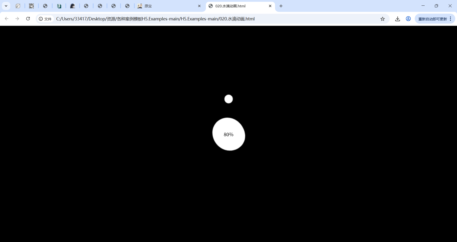
.drop类:定义了页面中类似水滴的元素样式。width: 100px和height: 100px:设置元素的宽度和高度均为 100 像素。border-radius: 50%:将元素的边框设置为圆形,使其看起来像水滴。position: absolute:将元素设置为绝对定位,方便在页面中精确控制其位置。filter: blur(20px):对元素应用模糊效果,使其边缘看起来更柔和。background-color: #fff:设置元素的背景颜色为白色。opacity: 0:初始时元素的透明度为 0,即不可见。animation: 2.5s drop linear infinite:应用名为drop的动画,动画持续时间为 2.5 秒,线性播放,无限循环。
.drop类的子元素选择器:通过:nth-child选择器分别对不同的.drop元素设置了不同的位置偏移和动画延迟,使它们的动画效果略有不同,增加了视觉层次感。.collection类:定义了另一个圆形元素的样式。- 基本样式与
.drop类似,也设置了宽度、高度、圆角、模糊效果和背景颜色。 animation: 3s collection linear infinite:应用名为collection的动画,动画持续时间为 3 秒,线性播放,无限循环。
- 基本样式与
<span>元素:设置为绝对定位,用于显示文本内容,但font-style: 30px这里可能存在错误,应该是font-size用于设置字体大小,猜测是想设置字体大小为 30 像素。
动画效果
@keyframes drop:定义了.drop元素的动画关键帧。- 在 0% 处,元素缩小到 0.7 倍并向上移动 600%,透明度为 0。
- 在 50% 处,元素缩小到 0.4 倍并向上移动 8%,透明度变为 1。
- 在 100% 处,元素缩小到 0.3 倍并回到初始垂直位置,透明度保持为 1。
@keyframes collection:定义了.collection元素的动画关键帧。- 在 0% 处,元素保持初始大小和旋转角度。
- 在 50% 处,元素放大到 1.3 倍并旋转 180 度,同时宽度变为 90 像素,边框的圆角也进行了调整。
- 在 100% 处,元素恢复到初始大小并旋转 360 度。
完整代码展示
<!DOCTYPE html>
<html lang="en"><head><meta charset="UTF-8"><meta http-equiv="X-UA-Compatible" content="IE=edge"><meta name="viewport" content="width=device-width, initial-scale=1.0"><link rel="stylesheet" href="./assets/global.css"><style>.container {display: flex;justify-content: center;align-items: center;min-height: 100vh;background-color: #000;flex-direction: column;filter: contrast(30);}.drop {width: 100px;height: 100px;border-radius: 50%;position: absolute;filter: blur(20px);background-color: #fff;opacity: 0;animation: 2.5s drop linear infinite;}.drop:nth-child(2) {transform: translateY(-80px);animation-delay: .5s;}.drop:nth-child(3) {transform: translateY(-130px);animation-delay: .7s;}.collection {width: 100px;height: 100px;border-radius: 50%;background-color: #fff;filter: blur(20px);animation: 3s collection linear infinite;}span {position: absolute;font-style: 30px;}@keyframes drop {0% {transform: scale(.7) translateY(-600%);opacity: 0;}50% {transform: scale(.4) translateY(-8%);opacity: 1;}100% {transform: scale(.3) translateY(0%);opacity: 1;}}@keyframes collection {0% {transform: scale(1) rotate(0deg)}50% {transform: scale(1.3) rotate(180deg);width: 90px;border-top-left-radius: 40%;border-bottom-right-radius: 45%;}100% {transform: scale(1) rotate(360deg);}}</style>
</head><body><div class="container"><div class="drop"></div><div class="drop"></div><div class="drop"></div><div class="collection"></div><span>80%</span></div>
</body></html>