OpenCV day2
Matplotlib相关知识

Matplotlib相关操作:
import numpy as np
from matplotlib import pyplot as plt

x = np.linspace(0, 2 * np.pi, 100)
y1 = np.sin(x)
y2 = np.cos(x)

# 使用红色虚线,圆点标记,线宽1.5,标记大小为6绘制sin
plt.plot(x, y1,
		 color="red",  # 红色
		 linestyle="--",  # 虚线
		 marker="o",  # 圆点标记
		 markersize=6,  # 标记大小为6
		 linewidth=1.5  # 线宽1.5
		 )

#使用绿色实线,方形标记,线宽为2,标记大小为8绘制cos
plt.plot(x, y2,
		 color="green",  # 绿色
		 linestyle="-",  # 实线
		 marker="s",  # 方形标记
		 markersize=8,  # 标记大小为8
		 linewidth=2  # 线宽为2
		 )

#显示图像
plt.show()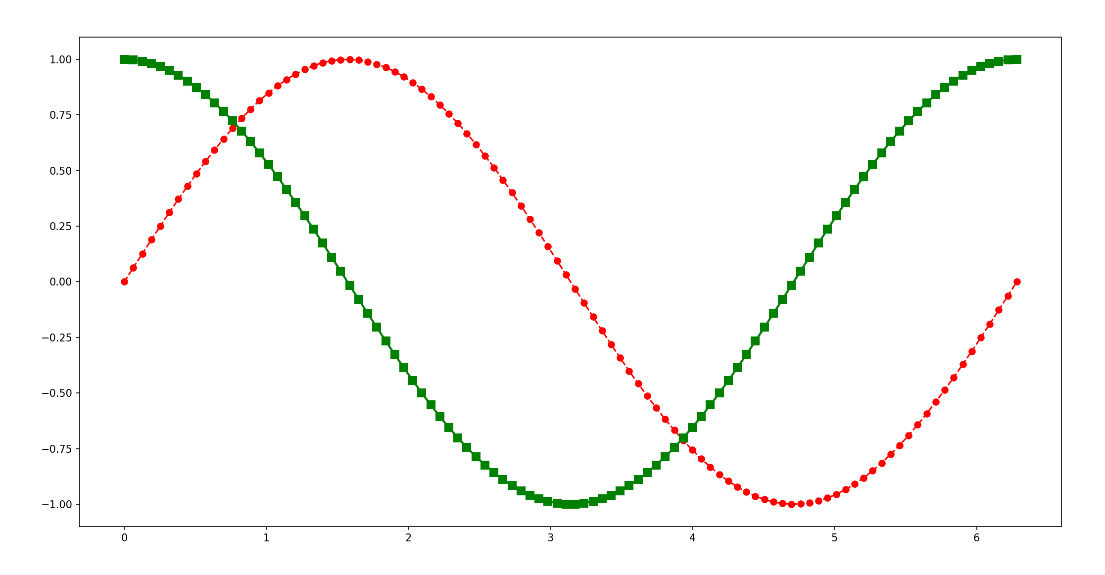
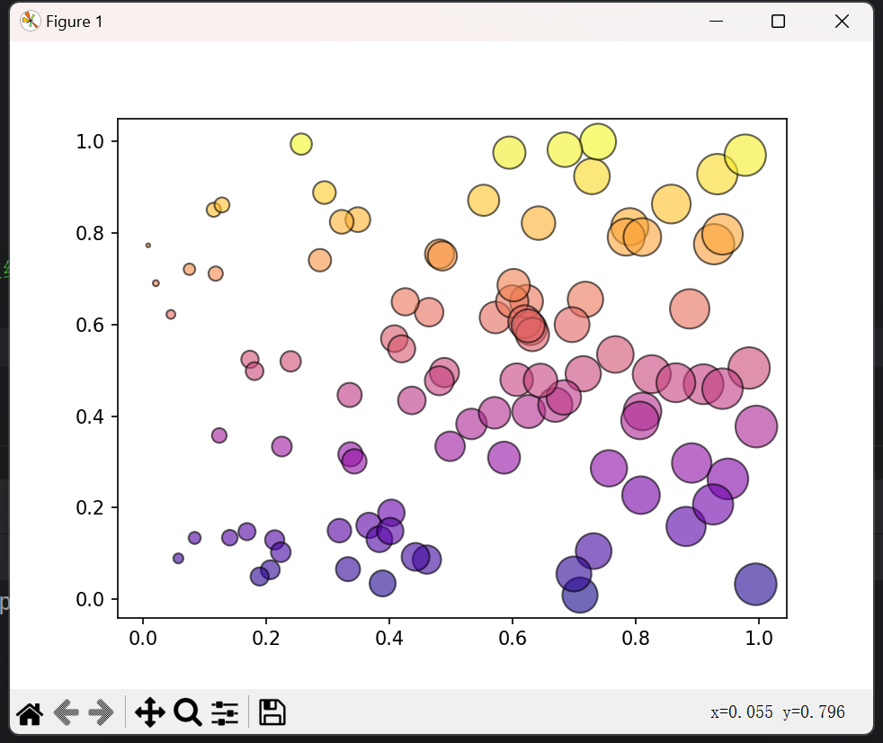
import numpy as np
from matplotlib import pyplot as plt

# 生成100个随机点
x = np.random.rand(100)
y = np.random.rand(100)

# 点的大小根据x坐标值线性变化
sizes = 500 * x

# 点的颜色根据y坐标使用'plasma'颜色映射
# 透明度为0.6,边缘颜色为黑色
colors = plt.cm.plasma(y)
plt.scatter(x, y,
			s=sizes,  # 大小
			c=colors,  # 颜色
			alpha=0.6,  # 透明度
			edgecolors='black'  # 边缘颜色
			)

# 显示图像
plt.show()
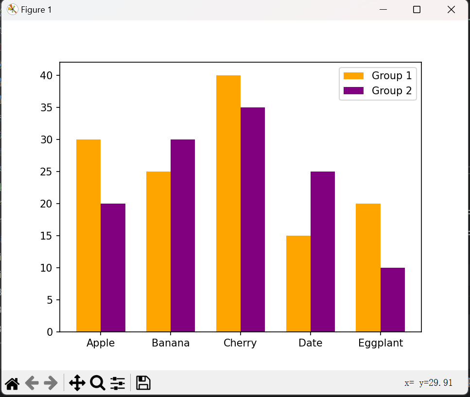
import matplotlib.pyplot as plt
import numpy as np

categories = ['Apple', 'Banana', 'Cherry', 'Date', 'Eggplant']
values1 = [30, 25, 40, 15, 20]
values2 = [20, 30, 35, 25, 10]

x = np.arange(len(categories))
width = 0.35  # 条形宽度

# 绘制两组并列的条形图,第一组颜色为橙色,第二组颜色为紫色
# 条形宽度为0.35, 添加图例
plt.bar(x - width/2, values1, width=width, color='orange', label='Group 1')
plt.bar(x + width/2, values2, width=width, color='purple', label='Group 2')
# 设置x轴刻度
plt.xticks(x, categories)

plt.legend()
plt.show()
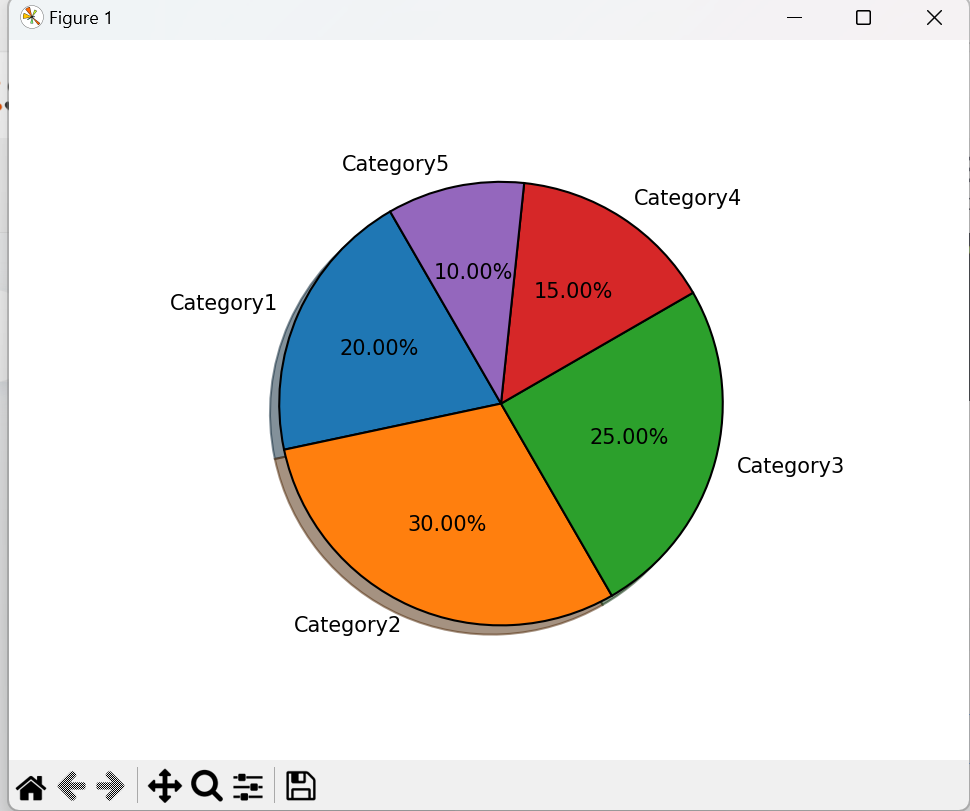
from matplotlib import pyplot as plt

# 数据
sizes = [20, 30, 25, 15, 10]
labels = ['Category1', 'Category2', 'Category3', 'Category4', 'Category5']

"""
绘制饼图,要求:
突出显示 Category2
显示百分比,保留两位小数
开始角度为 120 度
添加阴影
扇形边缘颜色为黑色,线宽为1
"""

plt.pie(sizes,
		labels=labels,  # 饼图标签
		autopct='%1.2f%%',  # 显示百分比
		startangle=120,  # 开始角度
		shadow=True,  # 添加阴影
		wedgeprops={'edgecolor': 'black', 'linewidth': 1}  # 边缘颜色和线宽
		)

plt.show()
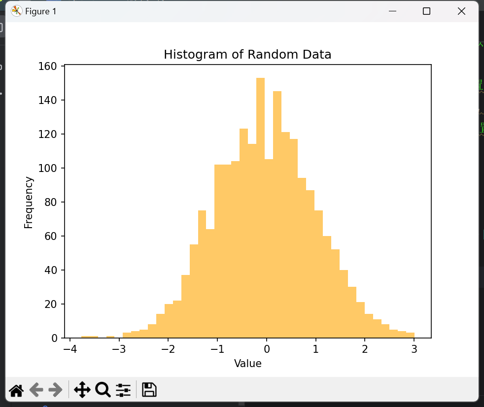
import numpy as np
from matplotlib import pyplot as plt

# 生成2000个服从正态分布的随机数
data = np.random.randn(2000)

# 绘制直方图,箱数为 40,颜色为橙色,透明度为0.6
# #设置合适的 x轴和 y轴标签以及标题
plt.hist(data,
		 bins=40,  # 设置箱数为40
		 color='orange',  # 设置颜色为橙色
		 alpha=0.6  # 设置透明度为0.6
		 )

plt.xlabel('Value')
plt.ylabel('Frequency')
plt.title('Histogram of Random Data')
plt.show()
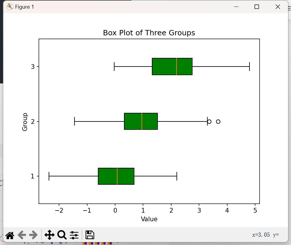
import numpy as np
from matplotlib import pyplot as plt

#生成三组数据,分别服从均值为0、1、2,标准差为1 的正态分布,每组150个数据
data1 = np.random.normal(0, 1, 150)
data2 = np.random.normal(1, 1, 150)
data3 = np.random.normal(2, 1, 150)
data = [data1, data2, data3]

#绘制水平箱线图,填充箱体颜色为绿色
plt.boxplot(data,
			vert=False,  # 设置箱线图方向为水平
			patch_artist=True,  # 填充箱体颜色
			boxprops={'facecolor': 'green'}  # 设置箱体颜色为绿色
			)


#设置合适的 x轴和 y 轴标签以及标题
plt.xlabel('Value')
plt.ylabel('Group')
plt.title('Box Plot of Three Groups')
plt.show()
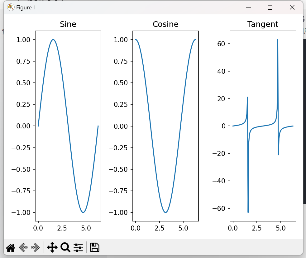
import matplotlib.pyplot as plt
import numpy as np

#生成数据
x = np.linspace(0, 2 * np.pi, 100)
y1 = np.sin(x)
y2 = np.cos(x)
y3 = np.tan(x)

#创建一个1行3列的子图
fig, axes = plt.subplots(1,3)
axes[0].plot(x, y1)
axes[1].plot(x, y2)
axes[2].plot(x, y3)
axes[0].set_title('Sine')
axes[1].set_title('Cosine')
axes[2].set_title('Tangent')
plt.tight_layout()
plt.show()
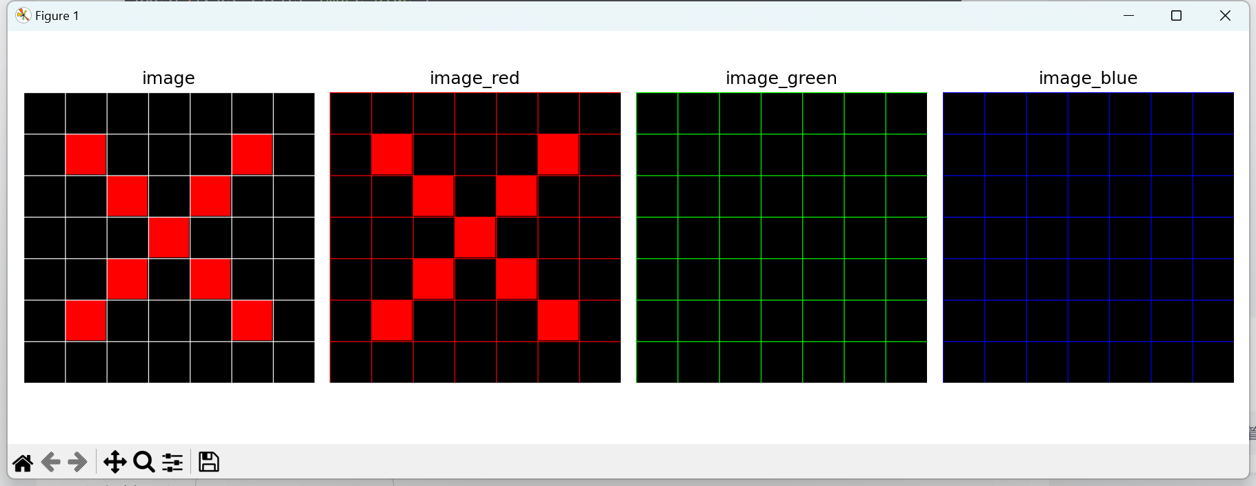
附加:
import numpy as np
import matplotlib.pyplot as plt

# 原始图像生成
# 创建一个700×700的图像数组(RGB),初始全部为黑色
image_arr = np.zeros((700, 700, 3), dtype=np.uint8)

# 定义每个格子的尺寸
cell_size = 100
line_width = 2  # 网格线宽度

# 绘制白色网格线
# 横向网格线
for i in range(0, 701, cell_size):
	image_arr[i:min(i + line_width, 700), :, :] = 255
# 纵向网格线
for j in range(0, 701, cell_size):
	image_arr[:, j:min(j + line_width, 700), :] = 255

# 利用双重循环遍历每个网格(7×7格子)
# 如果满足条件:对角线处格子 -> 填充红色
for i in range(1, 7):  # 行索引:1~6
	for j in range(1, 7):  # 列索引:1~6
		r_start = i * cell_size + line_width
		r_end = (i + 1) * cell_size - line_width
		c_start = j * cell_size + line_width
		c_end = (j + 1) * cell_size - line_width

		if (i == j or (i + j == 6)) and not (i == 6 and j == 6):
			image_arr[r_start:r_end, c_start:c_end, 0] = 255  # R
			image_arr[r_start:r_end, c_start:c_end, 1] = 0  # G
			image_arr[r_start:r_end, c_start:c_end, 2] = 0  # B

# 分离并可视化 RGB 三个通道
# 方法一:为每个通道创建一个与原图像相同大小的新数组,只保留该通道值,其他通道置0
image_red = np.zeros_like(image_arr)
image_green = np.zeros_like(image_arr)
image_blue = np.zeros_like(image_arr)

# 分别拷贝对应通道
image_red[:, :, 0] = image_arr[:, :, 0]  # R通道
image_green[:, :, 1] = image_arr[:, :, 1]  # G通道
image_blue[:, :, 2] = image_arr[:, :, 2]  # B通道

fig, axes = plt.subplots(1, 4, figsize=(12, 4))
axes[0].imshow(image_arr)
axes[0].set_title("image")

axes[1].imshow(image_red)
axes[1].set_title("image_red")

axes[2].imshow(image_green)
axes[2].set_title("image_green")

axes[3].imshow(image_blue)
axes[3].set_title("image_blue")

for ax in axes:
	ax.axis('off')

plt.tight_layout()
plt.show()