Uniapp:swiper(滑块视图容器)
目录
- 一、基本概述
- 二、属性说明
- 三、基本使用
一、基本概述
一般用于左右滑动或上下滑动,比如banner轮播图
二、属性说明
| 属性名 | 类型 | 默认值 | 说明 | 平台差异说明 |
|---|---|---|---|---|
| indicator-dots | Boolean | false | 是否显示面板指示点 | |
| indicator-color | Color | rgba(0, 0, 0, .3) | 指示点颜色 | |
| indicator-active-color | Color | #000000 | 当前选中的指示点颜色 | |
| autoplay | Boolean | false | 是否自动切换 | |
| interval | Number | 5000 | 自动切换时间间隔 | |
| duration | Number | 500 | 滑动动画时长 | |
| circular | Boolean | false | 是否采用衔接滑动,即播放到末尾后重新回到开头 | |
| vertical | Boolean | false | 滑动方向是否为纵向 |
三、基本使用
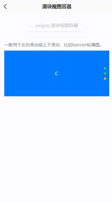
<swiper class="swiper" indicator-dots indicator-color="#32cd32" indicator-active-color="#ffaa00" autoplay interval="2000" duration="400" circular vertical><swiper-item><view class="swiper-item uni-bg-red">A</view></swiper-item><swiper-item><view class="swiper-item uni-bg-green">B</view></swiper-item><swiper-item><view class="swiper-item uni-bg-blue">C</view></swiper-item>
</swiper>
.swiper {margin-top: 10px;height: 300rpx;
}
.uni-margin-wrap {width:690rpx;width: 100%;;
}
.swiper-item {display: block;height: 300rpx;line-height: 300rpx;text-align: center;
}