Vue3:component(组件:uniapp版本)
目录
- 一、基本概述
- 二、基本使用
- 三、插槽
一、基本概述
在项目的开发过程中,页面上井场会出现一些通用的内容,例如头部的导航栏,如果我们每一个页面都去写一遍,那实在是太繁琐了,所以,我们使用组件来解决这一难题。
二、基本使用
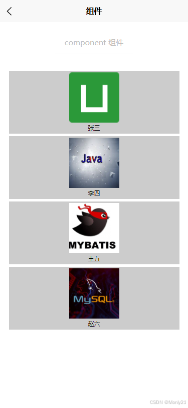
下面的案例中,我们定义一个用户信息展示的组件,通过传递一个对象来展示用户的头像以及姓名。
首先我们需要定义一个用户信息展示的组件user-info,uniapp中定义组件需要定义在根目录下的components中
<template><view class="box"><image :src="userImage" mode="aspectFill" class="user-image"></image><view class="user-name">{{userName}}</view></view>
</template><script setup>
import { computed } from 'vue';const props = defineProps({userName: {type: String, default: "匿名"},userImage: {type: String, default: "../../../static/logo.png"},obj: {type: Object, default() {return {userName: "匿名", userImage: "../../../static/logo.png"}}}
})
const userNameT = computed(() => props.userName + "@")
</script><style lang="scss" scoped>
.box {margin: 5rpx;width: 100%;height: 250rpx;background-color: #ccc;display: flex;flex-direction: column;align-items: center;justify-content: center;.user-image {width: 200rpx;height: 200rpx;}.user-name {margin-top: 5rpx;width: 100%;text-align: center;font-size: 14rpx;}
}
</style>
在主页面调用组件,uniapp会自动检索components下面的组件,所以在页面中不需要引入
<template><view class="box"><page-head title="component 组件"></page-head><view class="uni-padding-wrap uni-common-mt uni-flex uni-row uni-container"><user-info v-for="item in userList" :user-name="item.userName" :user-image="item.userImage"></user-info></view></view>
</template><script setup>
import { ref } from 'vue';const userList = ref([{userName: "张三", userImage: "../../../static/logo.png"},{userName: "李四", userImage: "../../../static/java.jpeg"},{userName: "王五", userImage: "../../../static/mybatis.png"},{userName: "赵六", userImage: "../../../static/mysql.jpeg"},
])
</script><style lang="scss" scoped>.uni-container {-webkit-flex-wrap: wrap;flex-wrap: wrap;}
</style>
三、插槽
我们在定义组件的时候,有的时候个别部分是不通用的,如果都单独创建一个特定的组件,那将会失去组件的真实意义,因此,vue为我们提供了slot插槽标签帮我们解决了这一问题,将单独部分进行定制。
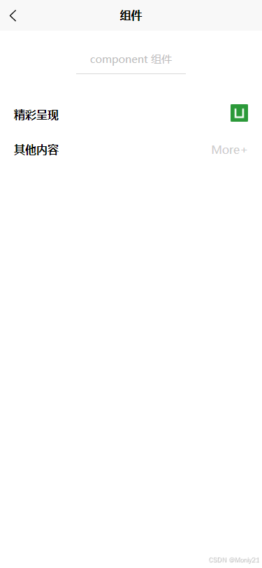
首先我们需要定义一个标题组件,在特定的区域,我们使用slot插槽进行留白。
<template><view class="box"><view class="box-title-t">{{title}}</view><view><slot name="icon"></slot></view></view>
</template><script setup>
const props = defineProps({title: {type: String, default: "这是啥?"}
})</script><style lang="scss" scoped>
.box {padding: 0 10rpx;width: 100%;height: 100rpx;display: flex;flex-direction: row;align-items: center;justify-content: space-between;.box-title-t {color: #000;font-weight: 700;}
}
</style>
在主页面中我们引入组件,并对组件进行定制,这里需要注意的是,插槽里面的样式要写在主页面中,如果写在组件里面,那会成为公共样式。
<template><view class="box"><page-head title="component 组件"></page-head><view class="uni-padding-wrap uni-common-mt uni-flex uni-row uni-container"><title-info title="精彩呈现" class="title-class"><template #icon><image src="/static/logo.png" mode="aspectFill"></image></template></title-info><title-info title="其他内容" class="title-class"><template #icon><text>More+</text></template></title-info></view></view>
</template><script setup></script><style lang="scss" scoped>.title-class {image {width: 50rpx;height: 50rpx;}text{color: #ccc;}}
</style>