使用Python在excel里创建柱状图
一、前言
通过使用Python的openpyxl库,在excel里创建柱状图。openpyxl库提供了创建Excel图表的功能,包括柱状图(Bar Chart)。
二、程序展示
1、导入相关模块,新建excel
新建excel后,在excel的第一列创建一些数据。
import openpyxl
from openpyxl.chart import BarChart
wb = openpyxl.Workbook()
sheet = wb.active
for i in range(1,13):sheet['A'+str(i+1)] = i
2、创建柱状图
创建柱状图,并设置数据范围。
参数说明:工作表,最小行,最小列,最大行,最大列
sheet为工作表
1,1,1,13分别代表:min_col=1, min_row=1, max_col=1, max_row=13
chart1 = BarChart()
chart_data_ref = openpyxl.chart.Reference(sheet, 1,1,1,13)
chart_range_ref = openpyxl.chart.Reference(sheet,1,1,10)
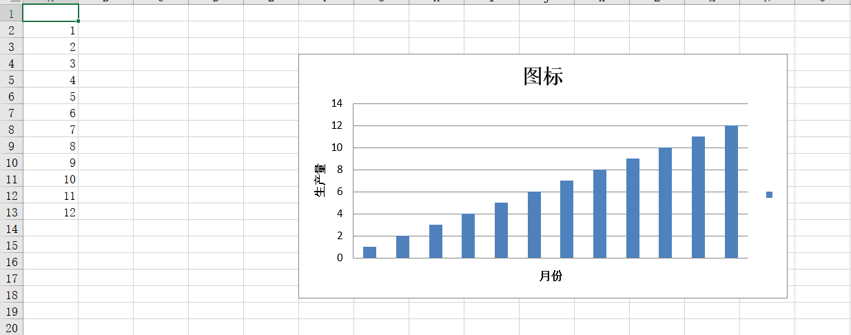
3、设置图标标题
图标标题、x轴和y轴数据标题。
chart1.title = '图标'
chart1.x_axis.title = '月份'
chart1.y_axis.title = '生产量'
4、添加数据系列到图标
chart1.add_data(chart_data_ref, titles_from_data=True)
chart1.set_categories(chart_range_ref)
5、保存图标和工作簿
sheet.add_chart(chart1, 'f4')
wb.save('F:\python_study\表格\chart1.xlsx')
6、运行后的效果