前端按钮动画
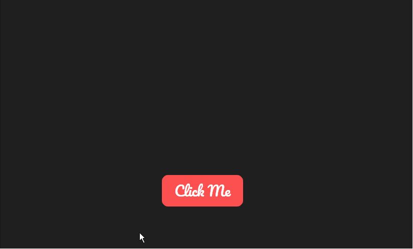
效果示例
代码示例
<!DOCTYPE html>
<html lang="en">

<head>
    <meta charset="UTF-8">
    <meta http-equiv="X-UA-Compatible" content="IE=edge">
    <meta name="viewport" content="width=device-width, initial-scale=1.0">
    <title>按钮点击动画1</title>
    <style>
        @import url('https://fonts.googleapis.com/css2?family=Pacifico&display=swap');

        html,
        body {
            width: 100%;
            height: 100%;
            display: flex;
            align-items: center;
            justify-content: center;
            background-color: #1f1f1f;
            font-family: 'Pacifico', serif;
            overflow: hidden;
        }

        span {
            position: relative;
            display: flex;
            align-items: center;
            justify-content: center;
            flex-grow: 1;
        }

        span::after {
            content: attr(data-text);
            position: absolute;
            background-color: #FC4F4F;
            border-radius: 10px;
            padding: 6px 20px;
            font-size: 22px;
            cursor: pointer;
            color: #fff;
            user-select: none;
            transition: transform 100ms ease-in;
        }

        span:active::after {
            transform: scale(0.9);
        }


        @keyframes pumping {
            50% {
                transform: scale(0.95);
            }
        }

        .shape {
            --size: 8px;
            position: absolute;
            top: calc(50% - var(--size));
            left: calc(50% - var(--size));
            width: calc(var(--size) * 2);
            height: calc(var(--size) * 2);
            animation: popup var(--d) cubic-bezier(.08, .56, .53, .98) forwards;
        }


        .heart {
            --size: 6px;
            background-color: var(--c);
        }

        .heart::before,
        .heart::after {
            content: "";
            position: absolute;
            width: 100%;
            height: 100%;
            background-color: var(--c);
            border-radius: 50%;
        }

        .heart::before {
            left: -50%;
        }

        .heart::after {
            top: -50%;
        }

        @keyframes popup {
            0% {
                opacity: 0;
            }

            60% {
                opacity: 1;
            }

            100% {
                opacity: 0;
                transform: translate(var(--x), var(--y)) rotate(var(--r));
            }
        }
    </style>
</head>

<body>
    <span data-text="Click Me"></span>
    <script>
        const colors = ['#FC4F4F', '#FFBC80', '#FF9F45', '#F76E11']
        // const shapes = ['square', 'circle', 'triangle', 'heart']
        const shapes = ['heart']

        const randomIntBetween = (min, max) => {
            return Math.floor(Math.random() * (max - min + 1) + min)
        }

        class Particle {
            constructor({ x, y, rotation, shape, color, size, duration, parent }) {
                this.x = x
                this.y = y
                this.parent = parent
                this.rotation = rotation
                this.shape = shape
                this.color = color
                this.size = size
                this.duration = duration
                this.children = document.createElement('div')
            }

            draw() {
                this.children.style.setProperty('--x', this.x + 'px')
                this.children.style.setProperty('--y', this.y + 'px')
                this.children.style.setProperty('--r', this.rotation + 'deg')
                this.children.style.setProperty('--c', this.color)
                this.children.style.setProperty('--size', this.size + 'px')
                this.children.style.setProperty('--d', this.duration + 'ms')
                this.children.className = `shape ${this.shape}`
                this.parent.append(this.children)
            }

            animate() {
                this.draw()

                const timer = setTimeout(() => {
                    this.parent.removeChild(this.children)
                    clearTimeout(timer)
                }, this.duration)
            }
        }

        function animateParticles({ total }) {
            for (let i = 0; i < total; i++) {
                const particle = new Particle({
                    x: randomIntBetween(-200, 200),
                    y: randomIntBetween(-100, -300),
                    rotation: randomIntBetween(-360 * 5, 360 * 5),
                    shape: shapes[randomIntBetween(0, shapes.length - 1)],
                    color: colors[randomIntBetween(0, colors.length - 1)],
                    size: randomIntBetween(4, 7),
                    duration: randomIntBetween(400, 800),
                    parent
                })
                particle.animate()
            }
        }

        const parent = document.querySelector('span')
        parent.addEventListener("touchstart", () => { }, false);
        parent.addEventListener('click', e => animateParticles({ total: 40 })
        )
    </script>
</body>

</html>