QML TableView:基础用法和自定义样式实现
目录
- 引言
- 相关阅读
- 工程结构
- 示例一:基础TableView实现
- 代码解析
- 运行效果
- 示例二:自定义样式TableView
- 代码解析
- 运行效果
- 主界面
- 运行效果
- 总结
- 工程下载
引言
TableView作为Qt Quick中的一个核心控件,具有高性能、灵活性强的特点,能够满足从简单列表到复杂数据网格的各种需求。本文将通过两个具体示例,分别展示TableView的基础用法和自定义样式实现,帮助读者全面了解这一控件的应用场景和开发技巧。
相关阅读
- Qt QML TableView官方文档
工程结构
这个工程采用了CMake构建系统,由main.cpp作为程序入口,加载Main.qml作为主界面。Main.qml中包含了两个TableView示例组件:BasicTableView.qml(基础表格)和CustomTableView.qml(自定义样式表格)。
示例一:基础TableView实现
代码解析
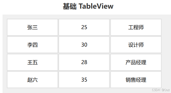
BasicTableView.qml实现了一个简单的表格,展示了人员的基本信息:
import QtQuick
import QtQuick.Controls
import Qt.labs.qmlmodelsRectangle {width: 400height: 300color: "#f0f0f0"TableModel {id: tableModelTableModelColumn { display: "name" }TableModelColumn { display: "age" }TableModelColumn { display: "occupation" }rows: [{name: "张三",age: "25",occupation: "工程师"},{name: "李四",age: "30",occupation: "设计师"},{name: "王五",age: "28",occupation: "产品经理"},{name: "赵六",age: "35",occupation: "销售经理"}]}TableView {anchors.fill: parentanchors.margins: 10clip: truemodel: tableModelcolumnSpacing: 1rowSpacing: 1delegate: Rectangle {implicitWidth: 120implicitHeight: 40border.width: 1border.color: "#dddddd"color: "#ffffff"Text {anchors.centerIn: parenttext: display}}columnWidthProvider: function(column) { if (column < 3) return 120return 0}rowHeightProvider: function(row) { return 40 }}
}
这个示例展示了TableView的基本用法:
- 数据模型:使用TableModel定义了表格的列和数据内容。TableModelColumn定义了三列(姓名、年龄、职业),rows属性包含了四行数据。
- 表格视图:TableView组件绑定了上面定义的数据模型,并通过delegate属性自定义了单元格的外观。
- 大小控制:通过columnWidthProvider和rowHeightProvider函数分别控制列宽和行高。
- 布局:使用anchors布局将表格填充满父容器,并设置了合适的边距。
运行效果
示例二:自定义样式TableView
代码解析
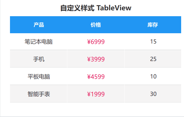
CustomTableView.qml实现了一个带有交互效果和自定义样式的产品库存表格:
import QtQuick
import QtQuick.Controls
import Qt.labs.qmlmodelsRectangle {width: 400height: 300color: "white"// 属性定义property int selectedRow: -1property int hoveredRow: -1readonly property int columnWidth: width / 3readonly property int rowHeight: 40// 颜色定义readonly property color headerColor: "#2196F3"readonly property color selectedColor: "#bbdefb"readonly property color hoverColor: "#e3f2fd"readonly property color priceColor: "#E91E63"readonly property color borderColor: "#e0e0e0"TableModel {id: customTableModelTableModelColumn { display: "product" }TableModelColumn { display: "price" }TableModelColumn { display: "stock" }rows: [{ product: "笔记本电脑", price: "6999", stock: "15" },{ product: "手机", price: "3999", stock: "25" },{ product: "平板电脑", price: "4599", stock: "10" },{ product: "智能手表", price: "1999", stock: "30" }]}// 表头Rectangle {id: headerwidth: parent.widthheight: rowHeightcolor: headerColorRow {anchors.fill: parentRepeater {model: ["产品", "价格", "库存"]Rectangle {width: columnWidthheight: parent.heightcolor: "transparent"Text {anchors.centerIn: parenttext: modelDatacolor: "white"font.bold: true}}}}}// 表格内容TableView {id: tableViewanchors {top: header.bottomleft: parent.leftright: parent.rightbottom: parent.bottom}clip: truemodel: customTableModelcolumnSpacing: 1rowSpacing: 1delegate: Rectangle {implicitWidth: columnWidthimplicitHeight: rowHeightcolor: row === selectedRow ? selectedColor : row === hoveredRow ? hoverColor : row % 2 ? "#f5f5f5" : "white"MouseArea {anchors.fill: parenthoverEnabled: trueonClicked: selectedRow = rowonEntered: hoveredRow = rowonExited: hoveredRow = -1}Rectangle {width: parent.widthheight: 1color: borderColoranchors.bottom: parent.bottom}Text {anchors.centerIn: parenttext: column === 1 ? "¥" + display : displaycolor: column === 1 ? priceColor : "#333333"font.pixelSize: column === 1 ? 14 : 13}}}
}
这个示例展示了TableView的高级用法:
- 交互效果:通过selectedRow和hoveredRow属性,结合MouseArea实现了行选择和鼠标悬停效果。
- 自定义表头:单独实现了表头部分,与表格内容区分开,提供了更灵活的样式定制。
- 条纹效果:通过row % 2条件实现了行交替背景色。
- 格式化显示:对价格列做了特殊处理,添加货币符号并使用不同颜色显示。
- 属性复用:通过readonly property定义了共用的样式属性,提高了代码的可维护性。
运行效果
主界面
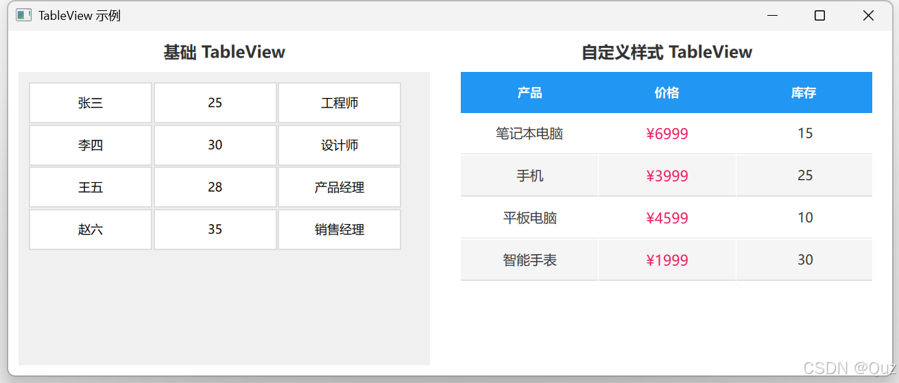
Main.qml文件作为应用程序的主界面,使用RowLayout将两个示例并排展示:
import QtQuick
import QtQuick.Window
import QtQuick.Controls
import QtQuick.Layouts
import "."  // 添加当前目录导入Window {width: 850height: 400visible: truetitle: "TableView 示例"RowLayout {anchors.fill: parentanchors.margins: 10spacing: 20Rectangle {Layout.fillHeight: trueLayout.preferredWidth: 400color: "transparent"Text {anchors.top: parent.topanchors.horizontalCenter: parent.horizontalCentertext: "基础 TableView"font.pixelSize: 16font.bold: truecolor: "#333333"}BasicTableView {anchors.fill: parentanchors.topMargin: 30}}Rectangle {Layout.fillHeight: trueLayout.preferredWidth: 400color: "transparent"Text {anchors.top: parent.topanchors.horizontalCenter: parent.horizontalCentertext: "自定义样式 TableView"font.pixelSize: 16font.bold: truecolor: "#333333"}CustomTableView {anchors.fill: parentanchors.topMargin: 30}}}
}
通过布局容器对两个示例进行了排版展示:
- RowLayout:创建了水平布局,使两个TableView示例能够并排显示。
- 标题文本:为每个示例添加了标题,以便于区分。
- 组件引用:分别引用了BasicTableView和CustomTableView组件。
运行效果
总结
通过本文的两个示例,展示了QML TableView的基础用法和自定义样式技巧。基础示例展示了TableModel和TableView的用法,适合初学上手;自定义样式示例则展示了更复杂的功能,包括交互效果、样式定制和数据格式化等高级特性。
QML TableView作为Qt Quick中的重要控件,具有以下优势:
- 高性能:针对大数据集优化,支持虚拟化渲染。
- 灵活性:通过delegate可以完全自定义单元格外观。
- 易用性:与其他QML组件集成良好,支持丰富的布局方式。
- 交互性:可以方便地添加选择、排序等交互功能。
工程下载
完整代码可以通过以下链接获取:Gitcode -> QML TableView示例